Early Development: Coppelia

Designing Coppelia
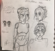
I'm an unfortunately visual person, so I like to have a character design before I even start writing; with Coppelia, I had a lot of different ideas of what I wanted her to look like, so I decided to do a few different concept passes to work out what she should look like. It wasn't until this stage I decided she would be a ballerina-themed puppet, and from then on, established one of my ongoing motifs.
Because I decided to be a little more on the nose with the ballet influences outside just referencing them with her name, I took to the internet to find design inspiration for Coppelia. And what way would be more appropriate than by using the ballet she takes her name from?
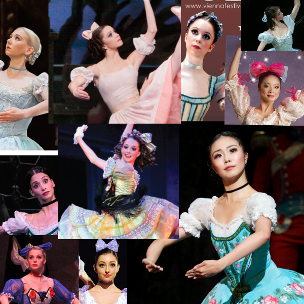
(You can probably see the influence on her second and third designs pretty clearly, because it wasn't until after I drew the first and started to draw a blank on how I could make it different that I looked for real-world inspiration. ) Most of these costumes have 3 common features: a choker/ribbon necklace, pulled up hair, and either a big hair bow, or some smaller hair decorations. The features in particular I latched onto were the center parts, their wispy baby hairs, and the sausage curls.
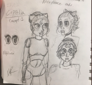
After gathering feedback from my roommmates and twitter followers, I then created my second design pass:
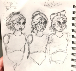
(I was having an extremely Weird art day, and no matter what I did, I couldn't get the faces to look quite right x__x. Also, if you asked me, I couldn't tell you why I got so fixated on her having a ventriloquist-dummy style mouth.)
As you can see, all three of this second pass took the most popular face shape- the round, Kewpie-like one- her forelocks, and two kept the very popular swept-back bangs. After that, it was back to the people for feedback, and the first of the designs was by far the most popular- although multiple people commented that the face, particularly the nose, of the third was the most interesting.
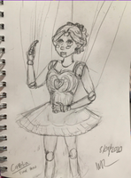
After all of that, i ended with this as the final design for our misguided protagonist:
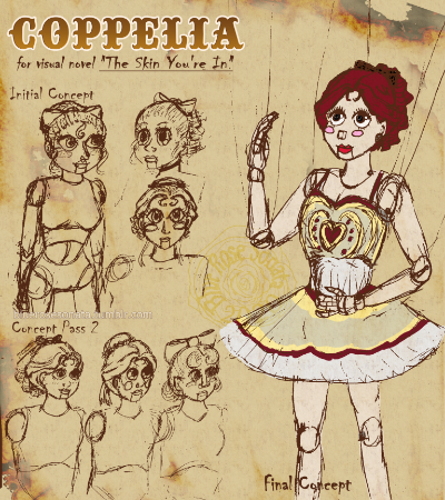
Some of you might recognize this as the initial promotional image I tweeted out when announcing my game; ultimately, I'm still really happy with her design, and I think the final version manages to convey an appropriate level of "doll like innocence," without being overly juvenile.
Her color scheme was something I agonized over as well, but ultimately went with the red/yellow/off-white. The off white was chosen for multiple reasons- to convey both a sense of age and decay, to symbolize her "off colored" innocence, and, most practically, so I could dramatically splatter it with blood, lol.
Personality
As mentioned in my previous log, Coppelia was also intended as an ingenue, an innocent, easily deceived and misled; however, thanks to this more mature design, she gained a little more savvy, and a bit more caution in my writing of her. Ultimately, what she's become over the course of writing is a brutally practical, but ultimately romantic character, driven by her newfound desire for a life beyond the stage- a life with the woman whom she's fallen in love with. A part of Coppelia still believes in magic and fairy tales, but unlike the initial concept of her, she's hardly a babe in the woods who thinks that humans can be disassembled just like puppets can.
Get The Skin You're In {DEMO}
The Skin You're In {DEMO}
In this Cinderella-meets-Frankenstein story, a puppet tries to build herself a body to win the heart of her Beloved.
| Status | On hold |
| Author | Blue Rose Sonata |
| Genre | Visual Novel, Interactive Fiction |
| Tags | Halloween, Horror, LGBT, Narrative, Psychological Horror, Ren'Py, Singleplayer, spooktobervnjam, Spooky |
| Languages | English |
More posts
- Still here, still workingFeb 09, 2021
- Progress Update: 11/21/2020Nov 21, 2020
- Just For Fun: Character PlaylistsNov 03, 2020
- 0.1 Demo Uploaded!Nov 03, 2020
- Early Development: Doctor JaniceOct 30, 2020
- Pre-Release: The PuppeteerOct 25, 2020
- script is finished~Oct 21, 2020
- Delays, Life Changes.Oct 10, 2020
- Early Development: The Beloved + UI progressOct 04, 2020
- General notes on future devlogs, why the game was pushed backOct 01, 2020
Comments
Log in with itch.io to leave a comment.
What a thorough design process! You can see where the inspiration came from but she's still such a unique, distinctive character. I'm really looking forward to seeing her in action when the VN comes out! With a personality like that I have a feeling she'll be a fascinating protagonist.
thank you! ^o^ I'm really excited/Interested to see how she's received, haha.